
Meridian Counsel
Replace a dated consultancy website with a clear, confident presence that earns the first meeting.
- Industry
- Professional services
- Project type
- Website redesign
Overview
The situation.
A redesign concept for a small professional-services firm whose existing site read as an online brochure from another decade.
The challenge
Prospective clients arrive already comparing two or three firms. A cluttered, dated site loses the comparison before anyone reads a word about capability.
Objectives
- Communicate seniority and judgment without jargon
- Make each practice area understandable to a non-expert
- Give every page one clear next step
Approach
What we did.
Cut the copy roughly in half, lead each practice area with the outcome rather than the process, and use restraint as the visual signal of expertise.
Services provided
- Content audit and messaging
- Information architecture
- Custom visual design
- Responsive build
- Analytics setup
Design solution
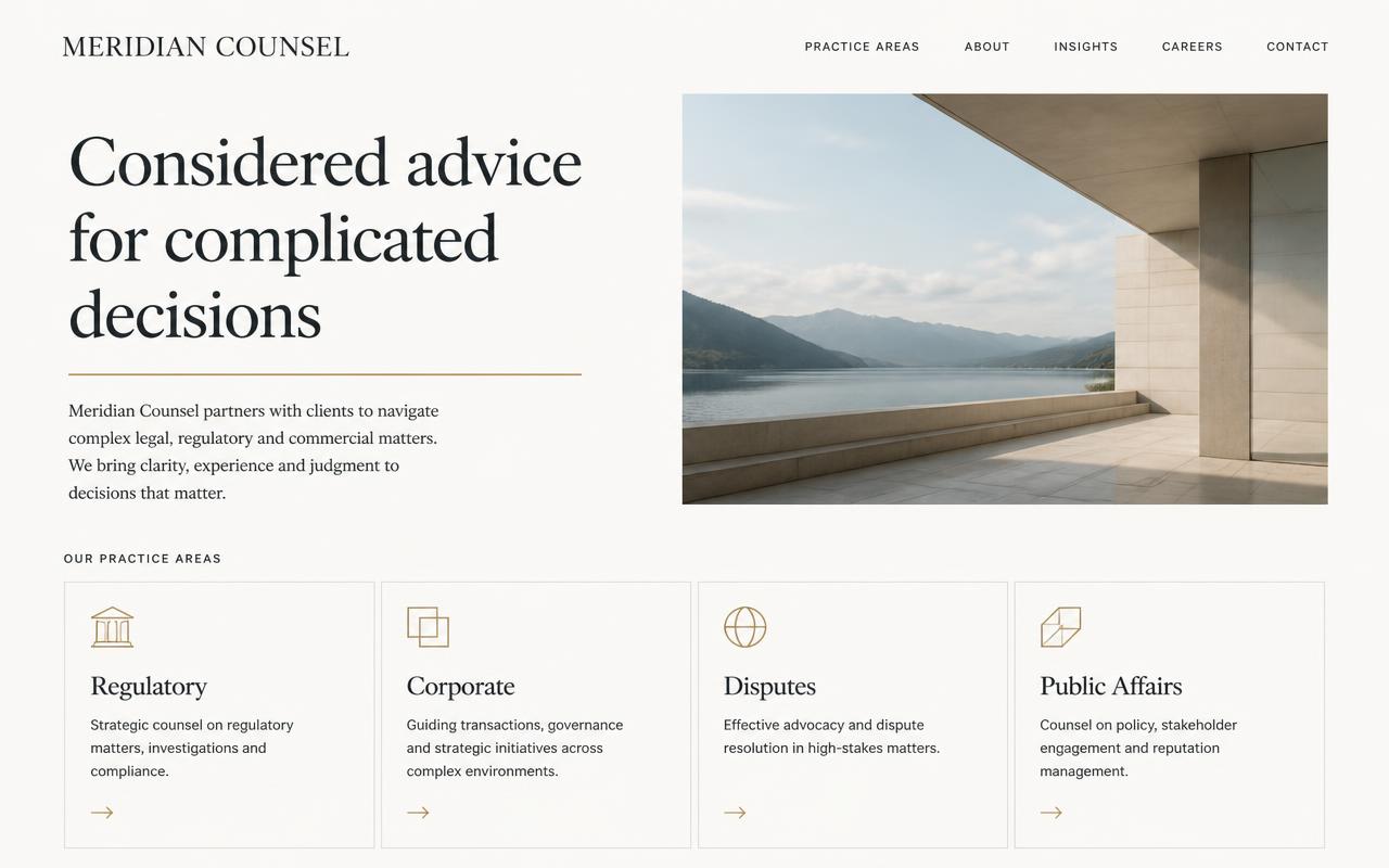
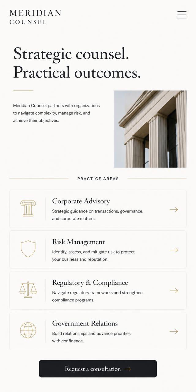
A near-monochrome system with a single muted-gold accent, wide margins and a strict typographic scale. Practice areas sit in an even grid so nothing appears more important than it is.
Functionality
- Consultation request form
- Practice-area detail pages
- Team profiles
- Structured data for a professional service
Before and after
What changed.
Before
Concept starting point: dense paragraphs, small type and a contact form buried in a footer.
After
Short, outcome-led sections with a consultation request available from every page.
No performance claims for this project
This is a concept build, so there is no live traffic or conversion data to report. Results are only published here when they come from a real, measured client project.
Next project
Willow & Clay
Show how a small maker can sell online without the store feeling generic or hard to manage.